
Joe Kovacs – Sometimes, events in the news become instant comedy without even trying. This is one of those times.
 A logo for the “Women’s Network” feminist group in Australia has been yanked after being mercilessly mocked for its apparent likeness to male genitalia.
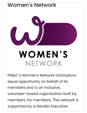
“Some things you simply cannot make up,” noted Hailey Sanibel at Blue State Conservative. “If the Babylon Bee had produced a logo for a dyed-in-the-wool feminist organization and meant to subvert it, it could not have a done a better job.”
News.com.au in Australia reported the logo was taken down after “it was mocked on social media for its phallic appearance.”
“Many at first assumed the logo was a fake because of its overt resemblance to male genitalia, while others were furious that it detracted from the actual purpose of the Network.”
“Phallic is an understatement,” said Sanibel. “Not only in a phallus clearly present, the logo includes the full range of external male genitalia. Like I said, you couldn’t make this up if you tried to mock woke losers.”
A spokesperson for the Department of Prime Minister and Cabinet told news.com.au: “The Women’s Network logo retained a ‘W’ icon which staff had been using for a number of years.”
“The rebrand was completed internally, using existing resources, and designs were consulted on widely. No external providers were engaged for this work.
“The logo has been removed from the department’s website, pending consultation with staff.”
Ronni Salt, a political and social commentator, laid into the government over the matter online:
“Why have the juvenile idiots in your department made male genitalia out of the Women’s Network logo?” Salt wrote.
“How hilarious. Let’s degrade women. Again. Anybody who understands graphic design knows this is deliberate. Anybody who didn’t catch this isn’t doing their job.”
She shared a graphic designer’s comments of a graphic designer, who stated: “The designer knew EXACTLY what they were doing from font choice to layout to color.
“This isn’t a mistake. It reeks of teenage boy malevolence.”
Others on Twitter noted:
♦ “I thought this logo was a weird kind of fake – hard to believe that this actually got approved.”
♦ “As a graphic designer I not only find this inappropriate, disgusting and degrading to women, it’s also a bad f***ing logo!”
♦ “To be honest I looked at the logo and saw a tampon which appalled me, I didn’t see the genitalia till I read this post.”
♦ “The THREE mentions of ‘members’ lays it on with a trowel.”
♦ “I’m surprised the ad agency responsible didn’t sign off the designer as ‘Dixon Ball.'”
SF Source WND Mar 2022
Parvati is the symbol of female-hood in the entire universe. Parvati is the vitality of male erection without which male is obsolete in its own world. Such a vitality must not cry or beg to be acknowledged by the otherwise dysfunctional male. Imagine the state of a male with a limpy-dimpy phallus. In fact the word man is contained in the word woman. Both must respect this natural condition, principle and law. Please do not create a conundrum for the nature. Both are opposite polarities for the sameness. Imagine the state of earth if its north magnetic pole begins to resist the south magnetic pole.